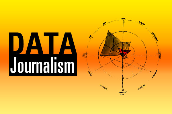
Tech: All About Data Journalism
Story by Hal Goodtree, first published on TechnologyTank.org. Graph from Mortality of the British Army, 1858.
Cary, NC – Sometimes, a word or phrase comes into focus around something we already understand, but have not yet named. Such a phrase is data journalism.
Data Journalism
The term data journalism came into focus for me in preparation for moderating a workshop at Cary Open Data Day.
Data journalism is creating content (stories or pictures) based on analysis of statistical information.
The best example of everyday data journalism is in sports. A table of projected rankings of NCAA tournament brackets is data journalism. A chart of salary vs. hitting percentage in Major League Baseball is data journalism.
The best known contemporary individual in data journalism is Nate Silver of The New York Times. Silver accurately predicted the winner of all 50 states and the District of Columbia in the last Presidential election. The interesting thing: Silver did no original research. His analysis was based on everyone else’s polls.
The History of Data Journalism
The Guardian claims the first foray into data journalism in 1821, with an expose on schools in Manchester. They published a table showing the prices paid for public schooling in the British city, revealing a far greater number of public-assistance students than perceived by the population.
The most famous example of 19th century data journalism is the masterpiece study by Florence Nightingale, Mortality of the British Army, 1858.
In the late 1950′s, data journalism took a quantum leap forward with the first “Computer Assisted Reporting” (CAR) of Presidential elections by broadcaster CBS.
In he 1970′s, data journalism was sometimes called “precision reporting.”
The first international data journalism conference was held in Amsterdam in 2010.
3 Steps of Data Journalism
Modern data journalism has three basic steps:
- Get Data
- Understand the data
- Communicate the data
Get the Data
For reporters at ESPN, there is ready access to lots and lots of rich data sets. But often, data journalism requires some finely honed search skills.
Some data is readily available as “streams” – XML or RSS feeds that are easy for machines to read. The City of Washington, DC has an Open Data Catalog.
In many cases, data must be discovered or “liberated,” through carefully combing websites or by initiating a public records request from a government agency.
Understanding the Data
The fundamental principle of analysis is that data does not equal facts. Information is not the same as knowledge.
Understanding the data is about creating plausible context in which the information makes sense.
Communicating the Data
This is where the writers and graphic designers get involved.
Everyday tools like Google Spreadsheets and Microsoft Excel can produce stunning charts and graphs. Popular data journalism features include use of “infographics” – data presented as a picture. Typography often plays an important role is data visualizations.
Another good practice is to include the data set in any presentation. That way, interested parties can see how you derived your conclusions and maybe hack another view or conclusion.
Finally, data journalism today means communicating your results across platforms – a blog, Twitter, Facebook and LinkedIn all come to mind. But a data visualization about food might find an audience on Pinterest. Or one about music might prove popular on Instagram.
More Information
For my workshop on data journalism, I collected a dozen or so links to examples and more in-depth information.
It’s an open document, so if you have data journalism links to add, please feel free.