CaryCitizen Gets a New Look
Cary, NC — Over the holiday break, we rolled out a new look and other improvements to CaryCitizen.com.
CaryCitizen Gets a New Look
We’ve had the same design since we launched CaryCitizen in 2009. For 2016, we’ve rolled out a new look.
The goal, other than “freshening things up,” was to present more topics to readers and visitors. With more than 5,000 published stories, some of the best stuff gets lost.
Now, you can see our most popular topics on the home page, even if we haven’t published something on that subject in the last couple of weeks.
House Cleaning the Website
Every website needs a good housecleaning from time to time. We’ve always kept things tidy on CaryCitizen, but the new version gave us an opportunity to combine some tags and categories and prune back some older posts.
In an effort to reduce the size of the database and speed up the website, we archived most posts prior to 2012.
We’ve kept most of the golden oldies (like “History: Cary’s Founder Frank Page” from 2010) but pruned out lots of stories about upcoming events that have come and gone.
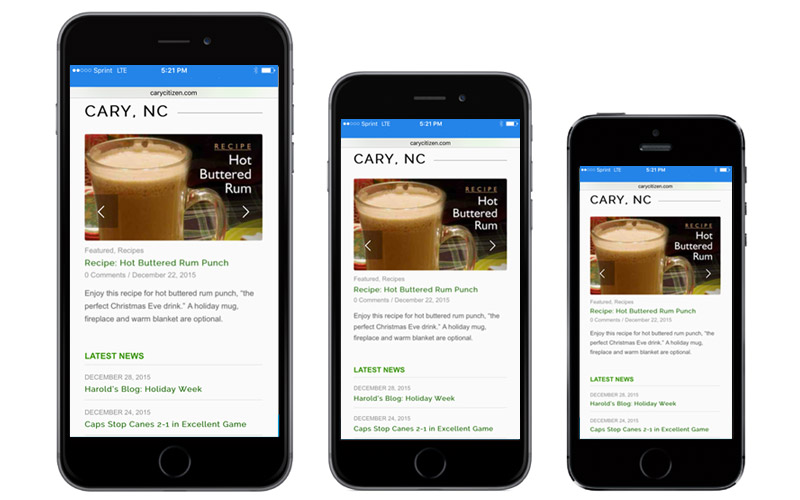
Better on Mobile
A big impetus to upgrade the design was to give a better experience on mobile devices.
The new design looks great on a mobile device with big type and all the content stacked for easy scrolling.
Still the Same
Mostly, we tried to keep the same feeling but improve ease of use. But it’s hard to let go of something you’ve lived with for 6 years.
We kept the clean white background with dark, easy-to-read text and green highlights. The menu still features the most popular topics.
And, of course, we’ve kept the focus on all the good things happening in Cary.
From all of us at CaryCitizen, have a happy and prosperous 2016!


some radon, unranked remarks;
Column at right of page —> lists contents in different order than what is across top of page.
I rarely visit site with smartphone. Use 7-inch tablet or laptop.
Most-frequently commented articles are now harder to find, but maybe that’s intentional to save moderator time. ;-)
I like the font and line spacing used at: https://www.ssa.gov/
Folks read left to right, and top to bottom. That makes upper left corner a real “hot-spot” to put the site’s search box!
Put all you can “above the fold” for a given article. Newstands’ newspapers have done it for years.
“A big impetus to upgrade the design was to give a better experience on mobile devices.
The new design looks great on a mobile device with big type and all the content stacked for easy scrolling.”
That’s great for the mobile devices, but wastes a lot of space a PC where everything used to pretty much fit on one screen. Now a lot of extra scrolling is needed on a PC that doesn’t flip pages with the touch of a finger.
Thanks for the feedback, Len. What size screen are you on? Could you send me a screen shot?
It’s a 20″ Acer P206HL widescreen monitor. I’ll see what I can do about sending you a screen shot.